Sunday, September 7, 2008
Poster : Don't burn her giraffe!

I used a very messy-like and an attracting colour type of text to give a "LOOK HERE, LOOK AT ME!" effect into the poster, and make them try to read the words. Because if I do that, people would then look at the poster, right?
I also filled the ground with flowers, veins and colorful grounds to portray the positive message that we can do it, it will look like that in the future, just you wait, we will work to give the future generation a happy place to live, free of global warming.
As well as the huge tree blocking the sun from shining and harming our future generation ; I think the meaning is quite obvious - it means trees, are 1 of the biggest options and methods to prevent global warming from harming them, protecting and nurturing them.
The fence is there also to show protection. You know, shepherds use a fence to round the sheep so they're safe in there, same applies to this poster ; the future generation shall be safe and sound as long as we prevent global warming from going on even more.
The huge, pathetic sun is there to try to harm our future generation more, but fail miserably.
Clear blue sky and fluffy clouds to show calmness and the beauty of nature if we do prevent global warming.
Colours used and meanings ;
Red, yellow, orange - to portray the heat, the sun, or just fire in general.
Brown - to portray the color of soil of the earth ; that includes the fence, as it's also made with wood, trees.
Green - the colour of nature ; trees and leaves
Pink - the colour of beauty into the nature
Assignment 3 steps

So I started off with this.

I added a brown ground using the pen tool.

And so i repeated the steps for the green ground and pink ground.

Remember this technique? I applied the ground shadow technique using the same one as I did during my assignment 2 - added new layer, drew the shadow paths with pen tool, copy the previous layer's ground and pasted at back on the layer of the shadow path, then using the select tool, I selected both the ground and shadow path and intersected them, then I used gradient tool on the ground and put multiply mode so it blends.

And I repeated the steps.
 Look! I used object > Blend > Blend options > Choose "Specified steps" > Set to 20 > blend on my flower petal, again.
After that, I formed a shape of a flower by using copy paste, and played with the transparency of the petals as well.

I copy pasted again and formed a bed of flowers on the ground.

I also used the same blend method to do the veins of for the flowers. Otherwise, how do you think they breathe or collect water from ground? :P

And then I created the fence using pen tool once again, copy pasted, and lined them in a row, then made a long horizontal rectangle to show that the fence are nailed to it to form a row, just like any other fences. And also, I added a clear blue sky background.


And then, I used the flare tool to show sunlight shining in the sky happily, and some clouds, then Gaussian blurred (with 14.0cm) the clouds to show blurriness and cloud-like elements.

And this, I added a sun using the ellipse tool and once again, Gaussian blurred it (with radius 14.0cm).

I felt like the sun wasn't threatening enough, so I used the select tool once again and maximized the sun to show threat.

Then, i made a simple tree with the pencil tool, and then I used chalk scribble brush to do the shadowed part of the tree.

Moved the tree into the background using the select tool to cover the sun up to show protection.

And time for the words, I played around with effect > warp and changed the outer line brush with chalk scribble brush again. Actually, I used the pen tool to create a path, then selected the type on a path tool to type over the line i created with pen tool,then played around with the paths. I also played around with the outer and inner line for the sub-description texts and just tilted it sideways using the select tool.

With that, I used the same method learnt and applied to the project charter for the poster. And I'm done.
Statement and stuff
Instead of saying something boring, ironic and/or cliched, I used a more childish/innocent type of statement to let the public be more guilty and ashamed of themselves for not taking any actions on stopping global warming in the first place. The future generation needs our protection, they're still young and new to the world. As their elders, we should do something. The elder should protect the young, right?
Idea :
To let the world be aware of the dangers our future generation may run into. If the future generation couldn't stop this dangerous threat, who will? Thus, in assignment 1 and 2, i used a baby and a toddler to represent the future generation, and a burning toy giraffe in her arm. I used a baby GIRL is because girls are uh, the ones who reproduce. As well as a happy-coloured background to show how happy the future generation will be with a new world, and a tree to block the sun, to portray protection to them from being burnt by the sun. With flowers, the beauty of nature, and how the world is suppose to look like!
Thursday, September 4, 2008
References and poster design-based thingus.

Awww! I plan to do the background something similar to this.

And this, as the design for the poster. Just the design, not the background, and except that the girl girl is carrying a burnt giraffe, and maybe the wordings may vary.
Sunday, August 17, 2008
Fix fix fix fix fix!

Friday, August 15, 2008
Future generation, take my world by storm!

Yes. That's my illustration, and assignment 2 for Computer Graphics 1.
Secret meaning behind the illustration...
Well, look at her, she's smiling even though her giraffe toy is burning, and not let go. Why? She's pretty confident she can put it out. You see, the future generation, no matter forced or voluntary, will have to put out global warming, or the world would go kabeesh, gone. As for that small plant on the ground, do you notice there is 1 piece of leaf that isn't burnt? That's a sign that shows that there is hope. THERE IS HOPE. Hope for the better world, hope for a world with decreased global warming signs! Technologies get more and more advanced as time goes on, so what is so impossible about getting strategies to put out global warming in the future? She's smiling, confident. They're confident, innocently confident. Are we gonna let them clean up our dirty doings? I say no, I'm ashamed to let them clean up our mess. So let's start helping today!
Colour schemes used...
Light-ish blue - symbolized calmness. Calmness of how the future generation (that includes us, university students too) takes in about global warming.
Red, orange, yellow - once again, to symbolize global warming ; fire. The earth getting warmer and warmer, until little giraffe is burnt! The giraffe's yellow and orange comes under here too, it's getting hot from the sun, thus, I used yellow and orange.
Brown - For the ground, earth and tree branch colour. Brown. ; for her hair, to show a wee-bit mutation in the human body. Imagine, black hair to brown. ; For her skintone, from getting too much sunlight and thus, getting a dark tan.
Green - the tree leaves, to show/represent the Earth's nature.
A little bit of black - to show the colours of ashes, and what will become of us and the world if we don't stop global warming!
Tools/effects that I used in illustrations are...
- Pen tool (of course)
- Brush tool
- Pencil tool (for the tree leaves so the specified steps' way of blending works)
- Ellipse tool
- Gradient
- Lasso tool (to select more precise than selection tool, especially the fire)
- Eyedropper tool (to select colour for the shadow sections)
- Zoom tool (to go closer, especially when I did her hair rubber band/acessory)
- Selection tool (to move the illustration position into a better way)
- Some effects like stylize -> inner/outer glow, distort and tranform -> zig zag etc
- Some transparency like transparency -> screen, and multiply
P/s : I took like, 1 and a half day to complete this. Steal this and I can make you enjoy pain by the end of this semester, just like Eddy.
Step by step.
 First, I dim the reference picture behind by 30% so that my pen tool doesn't get covered up by this cute little baby girl. And yes, you can see, I'm chatting while I do my work. I multi-task. :)
 Then, I slowly trace the picture with pen tool. Tsk, Randy Tan and his spammage on my yahoo messenger down there at the bar.
 And I'm 1/4 done with the face. I know, she doesn't look that cute and baby-looking anymore, don't need to remind me...
 And then I dim 30% on Mamima tall, the giraffe and repeat the same process, by tracing it over.
 Ta-dah! I finished tracing Mamima tall and baby girl's face! I freelanced the girl's body, though. I added in some colours to make sure they match, and not go out, or unbalanced. That's a base colour.
 I did her legs and adjusted the position of girl and Mamima giraffe.
 Oh uh, here comes the messy and hard-to-explain part. I added in some shadow section into girl and Mamima to create shades for them to look like there is sun. I intersected the shadow section into the base lines to make the shadow section more prominent. Also pen tool-ed.
 By now, I would expect everyone to know how to colour bases already. :) I coloured the base, and then used gradient on the shadow sections, after that I went to transparency -> select multiply to make the shadow section colours blend in really prominently into the base, to make it stand out but not too attention attracting either.
P/S : Suddenly my illustrator cs turned into illustrator cs3! SUPER!
 And so, I did some hoo-ha pretty effects on her hair acessory. First, I created a small darker blue circle with ellipse tool, then I blend it with the light blue outside by going to object -> blend -> make. Then, I used the ellipse tool again to create a gradient of black to white into the rubber band, and set transparency -> screen to make the rubber band balls to look very shiny. To do this, you MUST MAKE SURE that your black in the gradient is (that is, if you're using CMYK mode, I used it) C, M, Y and K=100, or it won't blend!
 And the main starrings are born!
 And so I did some tiny bit of background. I don't want to do much, or I don't know what I can do for assignment 3. Added the ground with ellipse tool, and set Effect -> distort and transform -> Zig zag for the distorted ground effect and effect -> stylize -> outer glow for the black glow. And I used the brush tool for some fancy strokes called thick pencil for the cracked ground. I also used a thick, brush tool called fude for the tree branch/vein. As for the leaves, I used my old trick that I used for my symbol for it - object -> blend -> blend option -> set to specified steps and insert random numbers -> ok -> make. :)
 BURN, MAMIMO GIRAFFE, BURN!!!!! Well, as usual, I use gradient on the fire layers 1 by 1, and set some effects like Effect -> Stylize -> Inner glow, and outer glow. Then I copy pasted, ctrl c then ctrl v and scaled the fire and added them randomly around.
 And then, I scaled and set the position of my symbol drawn for assignment 1. AND IT'S DONE!
I did my design on illustrator if that's okay.
 Picture courtesy to a guy in flickr.
...This cute little giraffe toy, Kathe Kruse Mamima Tall.
What did I do? I traced these 2 pictures together into illustrator straight.

...Erm, yeah. It turned out something like that, just a wee-bit nicer. This one is still in process, that's why it's not awesome yet, ahem.
P/S : Yes, I DID sketch on papers first before I decided to straight away design on illustrator. This link is the proof.
Wednesday, August 13, 2008
What is global warming?
What is - Global Warming?
"Global Warming is defined as the increase of the average temperature on Earth. As the Earth is getting hotter, disasters like hurricanes, droughts and floods are getting more frequent.
Over the last 100 years, the average temperature of the air near the Earth´s surface has risen a little less than 1° Celsius (0.74 ± 0.18°C, or 1.3 ± 0.32° Fahrenheit). Does not seem all that much? It is responsible for the conspicuous increase in storms, floods and raging forest fires we have seen in the last ten years, though, say scientists.
Their data show that an increase of one degree Celsius makes the Earth warmer now than it has been for at least a thousand years. Out of the 20 warmest years on record, 19 have occurred since 1980. The three hottest years ever observed have all occurred in the last eight years, even." -- Knowledge Allianz
Now you might have an idea on why I picked future generation as my sub topic. We all know how harmful it is when the sun gets too hot. We can get all kinds of sickness like skin disease/cancer, burnt skin, and so on.
"Ultraviolet (UV) light rays emitted by the sun are the cause of damage to our skin. This damage may be visible as age spots, fine (or not so fine) lines or simply as skin that has lost its elasticity eg hands that have lost their youthful suppleness.
There are two types of UV rays. UVA rays primarily cause an ageing effect on the skin and UVB rays primarily cause burning. The amount of UV reaching the earth's surface varies depending on factors such as the time of year, the time of day, the weather, the amount of ozone in the atmosphere and the altitude.
...Sunburn occurs when skin has not been sufficiently protected from the sun's UV rays, when the body is unable to produce enough melanin to protect the skin. Sunburn destroys cells on the skin's outer layer, the epidermis. In most cases these burns are minor, causing red, tender, sometimes blistered skin that sheds or 'peels' after several days." -- Unilever
It doesn't just sound harmful - it IS! Especially to our young future generation ; the babies, the toddlers, and the ones who are still in their mother's big bellies. What have they done to deserve this? They have yet to do anything to harm the Earth yet!
This is what I know about global warming. :]
Friday, August 8, 2008
References for illustrations
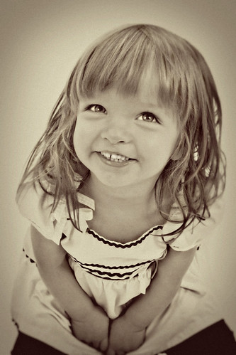
 Picture courtesy to Jiyu.
Since I can't do realism babies, I'll just do a cartoony one, more to my style. Yes, I've practiced realism babies on illustrator and they turned out to look like a 15-year old mutated girl who's screaming in pain.
And this is some super cute baby drawing style I might consider using.
 Picture courtesy to Egg-demon.
Picture courtesy to Rapsody.
That's pretty much it for baby references I might use for my illustration.
Friday, July 25, 2008
HIT ME ASSIGNMENT 2, HIT ME!!!!!!!!!!!!!!
Anyway, Yeah, assignment 2 is up~ I did some ideation and sketch already though.

P/S : I hate kids at time.
Do comment. ;D
Sunday, July 20, 2008
Symbol - Future generation

Hello. As you can see, I finished my symbol! My theme is Future Generations. Why did I choose this topic? I want to give an impact the world about what our children, grandchildren, children of our grandchildren about their suffering towards global warming if we don't stop it soon.
What is my symbol suppose to be? A candle-shaped baby being lit up. You can see by the melty-ness of the candle, as if the candle is fading, going extinct soon...
The hidden message? The meltyness is suppose to represent how our future generation will melt off - extinct, poof, melt away and be gone forever - in the future if we don't do something. The baby's hands were clutching together tightly as if trying to fight off the global warming, and the legs looks like they're about to stand up and fight off. Be shameful, you're letting your children, children's children, grandchildren's children to take care of our mess! And what if they fail to get up, and fail to go on? Let go, fall onto the floor and begone, forever? What if, just what if...
Our future generation WILL extinct if we don't stop this madness!
Explanation ;
SYMBOL DRAWING
Baby - To represent the future generation
Girl - Well, girls are the one who produce/nurture our future generation, a mother, so I chose a girl.
Hand clutching together - To show their suffering/struggling for the world, usually humans will tend to clutch and shut themselves up when they're afraid or scared, eh?
Flame - Global warming, the heat from global warming, right on top of our future generation. Well, the sun is above us, thus the heat comes from above us too.
Flame shine - The sunshine, or the sun in general. Global warming are somewhat caused by the heatness of the sun in some way, right?
COLORS
Red, yellow, orange - colors of the flame; color mixture of anger, fear, hatred
Grey - Grey is the colour that means unworthiness. The baby is unworthy and unhelpful, hopeless against the global warming and heat torture.
White - Color of innocence, in some way, the baby is innocent, it didn't cause global warming ; we did, and guess what, it has to suffer for what we're doing! Shameful.
Process of making my symbol on illustrator! :'D
Firstly,
 I drew some parts with pen tool and pencil tool, kinda like a mixture to test out the pens, ya' see? For additional info, The top part of the face (left) is done with pen tool, and the rest is pencil, I'm more used to pencil tool. As you can see, this is the shape of a baby, a representative of our future generations.
Secondly,
 Ta dah! 2nd layer! I added in baby's hair, and the hair looks melty-ish to make the baby look candle-ish. Well, she is suppose to be a candle.
Thirdly,
 Added the 1st part of the fire, I used gradient tool on the fire to make it look more realistic.
And so,
 And yeah, I did gradient-y part for each other flame colours in the flame too, in different layer to prevent it from overlapping each other. That's afterall, the use of layers, right? I also added gradient-y on the candle baby girl to make it look more realistic.
Then,
 Nothing much here, added more gradient-y on candle baby.
Next,
 This is the tricky part. I used blending on my pencil lines to make the colours mix in such a way it shows a very different kind of gradient colours, it does look like the baby is melting in a way, doesn't it?. How to blend? Object > Blend > Blend Options > Specified steps > set number > Blend. ;) I love this trick, though.
Almost there,
 And so I use the same blending trick on the fire shining thingie, with the Ellipse tool.
Conclusion,
 And I move it into the middle.
Simple? Explanation of symbol will be done on the post.